
 |
| Yes I took a picture of my press badge. Yes I am a big geek*. |
The first speaker I saw that day was Horace Mitchell, from NASA's Scientific Visualization Studio. "Scientists have very rich internal worlds," he said. "They visualize things a lot in their minds. We get that out so it excites other people." The studio posts everything they do online for free, "for anyone to use for any purpose." They share thirty terabytes of content every month. Thirty TERABYTES.
It's almost too much to handle; in fact, it is too much to handle and most of it never gets much attention. Remember that "perpetual ocean" visualization everyone was talking about in 2012? It had actually been sitting around on the NASA website since 2011, undiscovered until the studio's social media person decided to tweet about it.
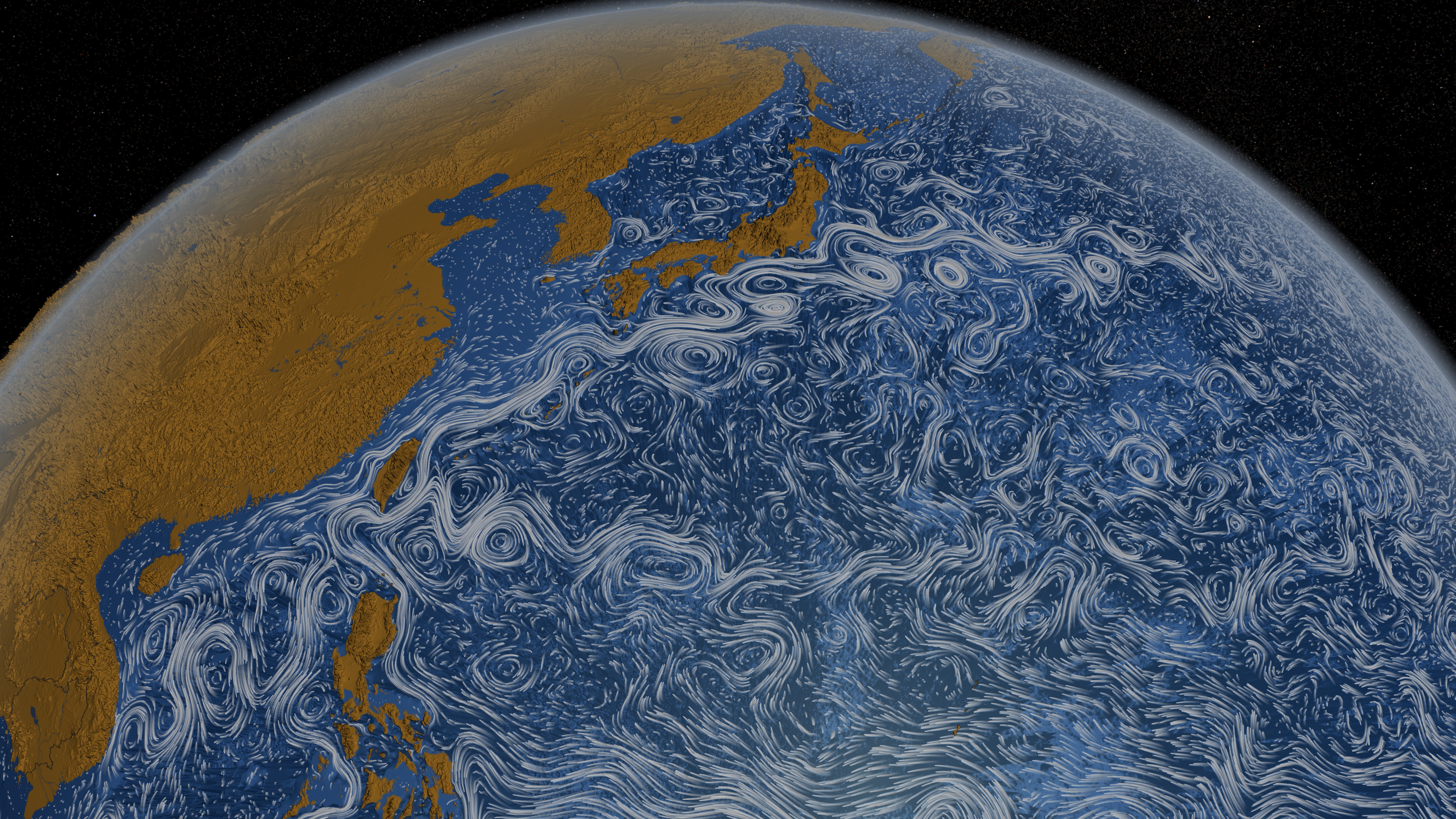 |
| Still from the Perpetual Ocean visualization. Do watch it. |
A nontrivial part of the work in making visualizations like this is to understand your audience. In the words of the session moderator, astrophysicist Tom Abel, "For an astronomer blue is very hot and red is very cold. And that would be very bad in the shower."
Mitchell followed this up with an example of the ozone hole. It's impossible to get data on ozone thickness directly above the South Pole, because the sun never shines straight down. The most accurate way to represent this visually is with an empty space. "But that's not the hole," said Mitchell. "The hole is an area of very low ozone around [the empty space]." If an image is only going to be shown for ten seconds on the evening news, the anchor isn't going to explain the difference between "no data" and "ozone hole." An image with an empty space would be confusing, says Mitchell, "So we should interpolate across it."
Speaking of holes and empty space, another astrophysicist, Ralf Kaehler, followed Mitchell's talk with a presentation on dark matter. "First I'll talk about what dark matter is," he said. "We don't know." Showing us an empty black slide, he commented dryly, "It's pretty clear that a direct photorealistic visualization is not a good idea."
 |
| Anscombe's quartet: four datasets with identical statistics and wildly different graphs. Visualization matters! |
And in some cases, the image is the data, such as pictures taken by Hubble and its cousin, the Spitzer telescope. No, I'd never heard of that one either. I learned about it in the AAAS Exhibit Hall, where NASA had put up their rather amazing hyperwall for several presentations, including one about Spitzer. This telescope images the sky in infrared wavelengths, which are too long for our unaided eyes to detect. Shorter IR wavelengths pass through dust without being obscured, which provides a much clearer view of the Milky Way than we're accustomed to. But remember, dust is important--stars are made of it. Longer IR wavelengths show you the radiation emitted by the dust itself, and you can see it flowing into the spiral arms of our galaxy, condensing into proto-stars and blowing out into nebulae.
And if love indeed binds everything together (N.B. research connection between love and gravity) then I can't think of a better picture for Valentine's Day.
 |
| Infrared view of the Milky Way. "Star-forming regions appear as swirls of red and yellow, where the warm dust overlaps with the glowing organic molecules." |
* An early version of this post used the word "dork." This error has been corrected by the author's father, who should know.
No comments:
Post a Comment
Note: Only a member of this blog may post a comment.